Shades of Gray at the Gray Loft Gallery
This January, I had an opportunity to attend an art exhibit called Shades of Gray. No, it has nothing to do with the infamous novel by E.L. James. Rather, it was the “10th Anniversary Photography Exhibit” held at the Gray Loft Gallery in Oakland, CA from December 10, 2022 to January 21, 2023. Truth be told, I had never been to an art exhibit before, so I was extremely excited to attend the group photo exhibit, to say the least!

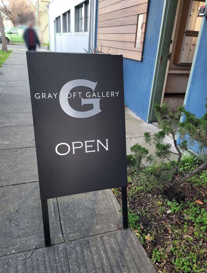
The Gray Loft Gallery was located inside a tall, multi-story building. You had to take several flights of stairs to get to the actual gallery with all the artworks.

As I made my way upstairs, I came face to face with a lady and her adorable little dog that hopped down besides her.

I presumed her to be a family member or friend of one of the artists, and fawned over her dog as I passed by. To my surprise, the lady smiled and pointed out that I would soon be seeing her dog in the exhibit. I didn’t really know what she meant at the time, so I just smiled back and moved along. Boy, was I in for a pleasant surprise!
“Room 32”
Once I reached the floor where the exhibit was taking place (which, I believe was the third floor), I was met with a small table with flyers displayed:

There were name cards and such of the artists whose works were being displayed. Taking a few with me, I stepped inside Room 32 and officially began my Shades of Gray experience.

The gallery was basically a large room with dividers with artworks hung here and there on the walls.


The photographs were mostly in shades of gray, with a few exceptions. But as its name suggested, the exhibit was mostly a collage of black, white and gray.
Pleasant Surprises
Amidst the artworks and people casually conversing amongst themselves, there was a station serving wine and treats with these pretty light decorations.


Visitors had the chance to support the gallery by tipping cash in this glass jar (shown above) or they could purchase the actual artworks displayed. If I recall correctly, most of the prices I saw were in the hundreds. I did see that some works had been claimed, as they had these red circle stickers below them.

As I was cruising around the room with my drink in hand, I almost froze because I came face to face with the aforementioned dog. There it was, staring me in the eye!

It was such a pleasant surprise to see the dog again! 😂 But I think the dog was cuter in person, hopping down the stairs next to its owner. And for some reason, it looks angry in the photograph. Well, anyways, I think I appreciated the artwork so much more after having actually met the dog beforehand.
(Some of) My Favorites
I’m not exaggerating one bit when I say that I thoroughly enjoyed viewing all the artworks at the exhibit. These photographs were not just simple photos; they were captivating images that all spoke different messages through objects and figures captured. Looking back, it’s fascinating how moving each of the still images were! But these are some of the ones that I remember vividly:
1. Rub my eyes 8 2022 by Francis Baker

This work was one of the few that were not completely in black and white. Yet, it fit the theme and the exhibit so well. For more works created by the artist behind this dreamy palette, visit the official website at francisbaker.com or on Instagram HERE.
2. Gorongosa Solitude by Mark Overgaard

This pigment inkjet print reminiscent of a page from The National Geographic caught my attention for its simplicity and beauty. But now, after discovering that “Gorongosa” means “place of danger” in the indigenous Mwani language and learning about the history of the land in Mozambique, I appreciate this work much more than meets the eye.
To learn more about the artist behind the work, visit his official website HERE and check out his “About the Artist” page. His story is fascinating as well.
3. Three Fish by Susan West

I remember looking at this work and thinking, “Shouldn’t the title be ‘Four Fish’?” Whether there are 3 fish, 3.5 fish or 4 fish (or 7 if counting the shadows), this work by Susan West is fun to look at, even now.
To view more work, visit the artist’s official website at: susanwestphotography.com.
4. Dreams of Old Birches by Anne Rabe

Another artwork that had palettes other than shades of gray, Dreams of Old Birches was memorable in that it incorporated a piece of an actual tree. And the title of the work makes you wonder what those dreams were. For more work by Anne Rabe, visit her official website www.amr-photography.com and Instagram account HERE.
5. Desert Spirit by Melina Meza

I actually had the chance to eavesdrop on what the artist was saying about this work. If I remember correctly, she said that the original colors of Desert Spirit was a conglomerate of colors found in the desert. And I actually found Desert Spirit in its colorful original HERE! Check out more of the yoga instructor/writer/teacher/photographer’s works on the official website: www.melinameza.com/fineartphotography.
6. Armenia by Candice Jacobus

This work I specifically remember because of the majestically eerie landscape accompanied by a speck of green. Back when I was at the exhibit, I assumed that it was taken in some magical place in Armenia. Upon research, I did found out that, indeed, the photograph is of basalt rock formations called the “Symphony of the Stones” and “Basalt Organ” in Garni Gorge, Armenia.
More works by Candice Jacobus can be found on the artist’s website at www.candicejacobusphotography.com and Instagram account HERE.
7. The beginning of hope/The hope of beginning by J.M. Golding

Not only was I blown away by the beauty of this photograph (I mean, a lake/pond of water touching the evening sky? It doesn’t get any more romantic or aesthetic than that!), but also I was taken aback by just how beautiful the title was. For more works by J.M. Golding, visit the official website at www.jmgolding.com.
8. Butterflies of My Memory by Sonia Melnikova-Raich

Butterflies of My Memory made an impression on me for a number of reasons. 1) As someone who values history and cherishes memories, I couldn’t help falling in love with the title and its dreamlike imagery. 2) The structure behind the butterfly silhouettes somehow reminded me of the Bay. As a traveler dwelling in the area, this work holds much meaning to me.
But I just found out that this photograph was taken in Mexico City during the artist’s visit to La Casa Azul where Frida Kahlo had lived in! It’s incredible how one can take any imagery and fit it to one’s own perspective and experiences regardless of what it actually portrays.
To learn more about the artwork, visit Sonia Melnikova-Raich’s website HERE or Instagram account at www.instagram.com/soniamelnikovaraich.
9. Adriatic Tempest IV by Laurel Anderson Malinovsky
Lastly but certainly not least, is the tempestuous photograph by the artist Laurel Anderson Malinovsky. I got to listen to the artist talk about her work, and I was told that she had taken this photograph while visiting Eastern Europe. She explained that these dark clouds suddenly filled the sky above her and she had never seen anything quite like this before:

The reflection of the glass doesn’t do the photograph justice. When you look at it in person, the contrast of the colors are quite striking. The shades of gray displayed in the clouds, to me, feel like an allegory for a turmoil of human emotions.

To look at more of the artist’s works, visit her official website at www.cipherartanddesign.com.
Conclusion
Though I was excited even before the event, I did not expect to have this much fun at the exhibit. And I think overall the Gray Loft Gallery did a great job providing a space for its artists to showcase their works. I especially appreciated the see-through curtains and this *mobile installation, which I believe was not an artwork but a decoration. It added a nice touch to the event:

And the view out the gallery was phenomenal at sunset! To look out the window to find these splash of vibrant colors was a pleasant, artistic contrast to the shades of gray displayed inside.

All in all, it was a highly enjoyable experience. I wish they had held the exhibit longer than the 1 month and 11 days they held it for… I will have to visit the Gray Loft Gallery again for another one of its exhibits!


📝 Want to read more about the Shades of Gray exhibit? Visit Malcolm Ryder’s review of the event at www.malcolmryder.com/post/review-photography-at-gray-loft-gallery-dec-2022.
🎨 HERE is the link to Gray Loft Gallery’s official website! Check out their “Upcoming Events” for art shows you can visit when you’re in the area.